Reporting and analysis
À l'issue de ce chapitre
- build an analysis with the graph and pivot views;
- make use of the dashboards shipped with the applications;
- rework data in a connected spreadsheet;
- set up alerts and periodic reports.
Odoo produces its analyses from the data entered day to day, with no export and no reprocessing. This chapter covers the analysis views common to every application, the dashboards and the connected spreadsheets.
The analysis views
Two views are dedicated to analysis and are found on most screens. Some analyses also have a specific view, suited to their subject.
Graph view
- Open an analysis screen: for example Sales › Reporting › Sales.
- Click the graph icon, top right.
- Choose the type of representation: bar, line, pie.
- Select the Measures to represent.
- Choose the breakdown criterion with Group By.
Bars can be stacked to compare subsets, and sorting by value ranks the results from largest to smallest.
Pivot view
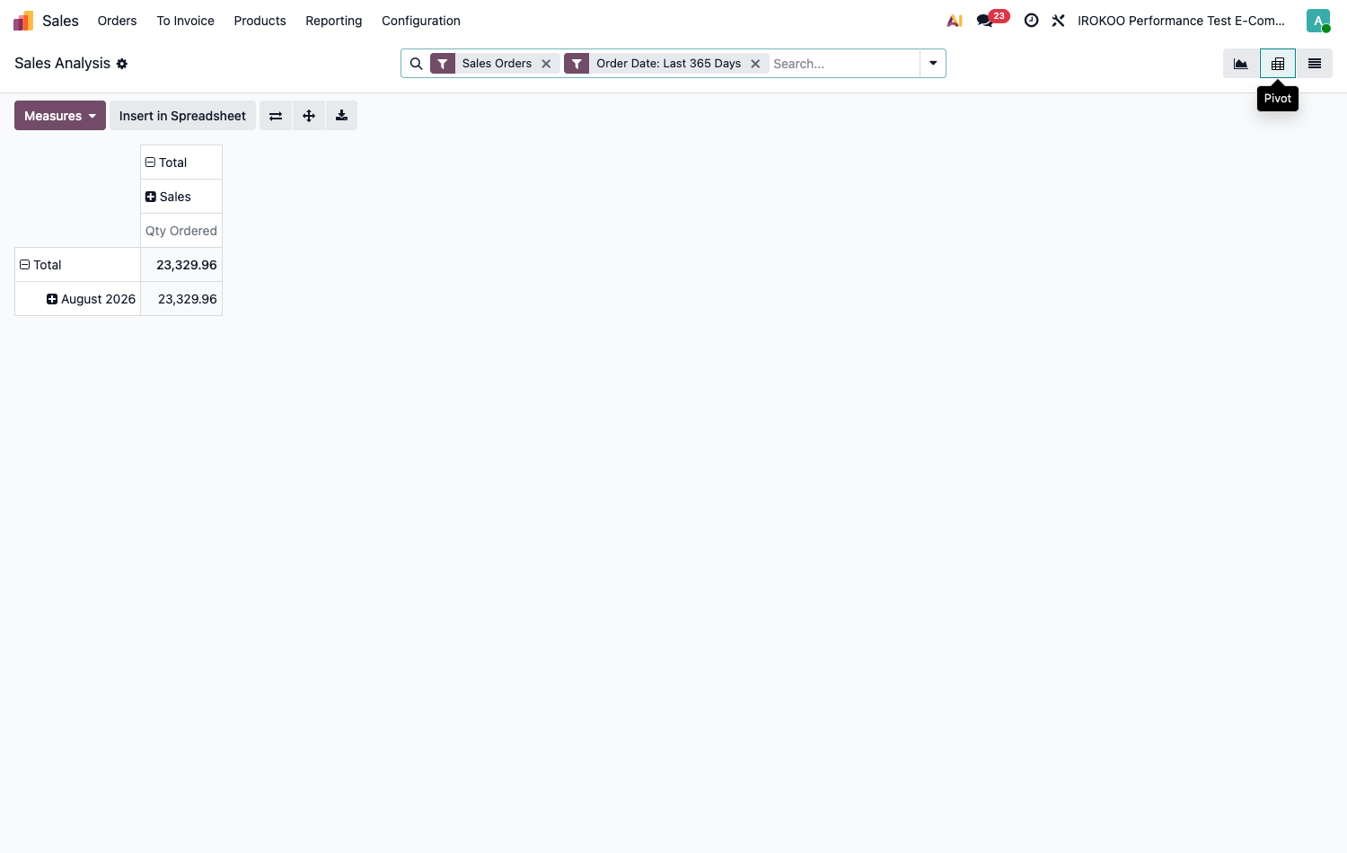
- Click the pivot table icon.
- Place one criterion in rows and another in columns, by clicking the headers.
- Select the Measures to display: amounts, quantities, margins, record count.
- Expand the levels to drill down into the detail.
Astuce
The pivot table answers questions about figures, the graph answers questions about trends. Start with the pivot to establish the numbers, switch to the graph to present them.
Cohort view
The cohort view tracks over time the behaviour of groups formed on the same date: how many of the opportunities created in January are still open in March, how many of the subscriptions taken out in the first quarter are still running a year later.
Point d'attention
Unlike the list, kanban, pivot and graph views, the cohort is not available everywhere. It belongs to the Enterprise edition and exists only on the screens where it has been provided for.
To see for yourself, open CRM › Reporting › Pipeline: the cohort icon appears in the view switcher, top right, next to the graph and the pivot table.
Note
The screens that offer it, depending on the applications installed:
| Application | Screens concerned |
|---|---|
| CRM | pipeline analysis |
| Helpdesk | ticket lists and their analysis reports |
| Subscriptions | subscriptions and their report |
| Events | registrations |
| Recruitment | the stages of the process |
Elsewhere, the view switcher does not offer it. This is not a missing setting: the view has not been declared for those screens, and no option will add it.
Reading the screen. Each row is a cohort: the items that entered in the same period. The columns
that follow count the periods elapsed since: +0 for the starting period, +1
for the next, and so on. The cell gives what is left of the group, in value and as a percentage. The
Average row aggregates all the cohorts.
Three controls govern the display: Measures chooses what is counted (Count by default, or an amount, the adjacent selector sets the granularity) Day, Week, Month, Quarter, Year, and the download icon exports the table to spreadsheet format.
Astuce
On the screens where it exists, the cohort answers a question that neither the graph nor the pivot table can ask: what becomes, over time, of the items that entered together? That is the reading which reveals a gradual deterioration (a conversion rate that collapses beyond six weeks, for instance) invisible in a monthly total.
Building an analysis
- Open the analysis screen concerned.
- Narrow the scope with Filters: period, company, team, status.
- Choose the axis of reading with Group By.
- Select the relevant Measures.
- Switch between views without losing the filters applied.
- Save the result in Favorites to come back to it directly.
Point d'attention
Always check the period filter before reading a figure. Most analysis screens apply a default filter (the current year, the current month) which is not necessarily the one you think you are reading.
The standard reports
Each application provides its ready-to-use analyses:
| Area | Available analyses |
|---|---|
| Sales | Revenue by customer, product, salesperson; margins; forecasts. |
| CRM | Pipeline, conversion rate, lost reasons, forecasts. |
| Purchase | Spend by vendor, lead times, price differences. |
| Inventory | Stock, valuation, move history, forecasts. |
| Manufacturing | Quantities produced, duration variances, costs, scrap. |
| Accounting | Balance sheet, profit and loss, general ledger, aged balances, taxes. |
| Project | Progress, time spent, profitability. |
The dashboards
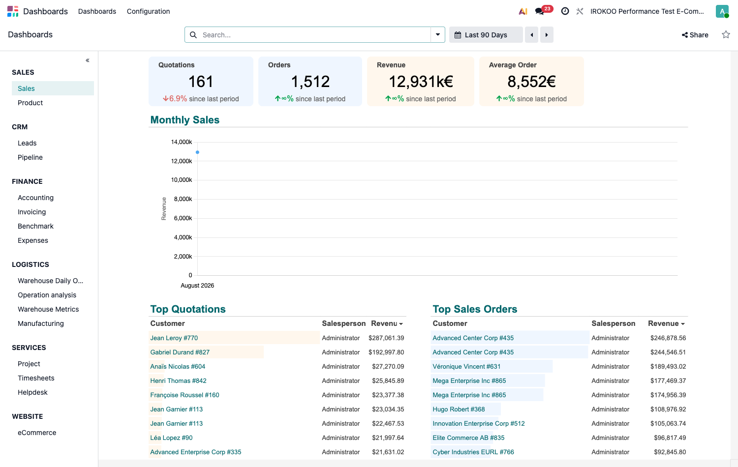
The Dashboards application gathers ready-to-use dashboards, fed live by the data in the database.
Viewing
- Open the Dashboards application.
- In the left-hand panel, select the section you want: for example Logistics.
- Click the name of the dashboard: it opens in the main view.
Filtering
- The period selector, above the dashboard, restricts the analysis to an interval. By default it shows all the data.
- The time granularity (day, week, month, quarter) is set on the charts concerned.
- The search bar filters on a dimension: a customer, a vendor, a team.
- Global filters apply simultaneously to every element of the dashboard.
Customising
The screen that displays a dashboard is read-only in everyday use: no button on it allows any change. Modification goes through the application's configuration.
- Open Dashboards › Configuration › Dashboards.
- The list shows the sections: Sales, Finance, Logistics, Services, Marketing, Website, Human Resources, to which CRM and Subscriptions are added depending on the applications installed. These are the entries in the application's left-hand panel.
- Open a section. The Spreadsheets tab lists the dashboards it contains, one per row.
- Click Edit at the end of the row: the dashboard opens in the spreadsheet editor, with the tools described in section 19.5.
- Add a line creates an additional dashboard in the section.
Each row also carries the distribution settings:
| Column | Role |
|---|---|
| Name | Label shown in the application's left-hand panel. |
| Group | User groups allowed to see the dashboard. Defaults to Role / User. |
| Companies | Restricts visibility to certain companies. The column only appears in a multi-company environment; left empty, it shows Visible to all. |
| Data | The spreadsheet file, in .osheet.json format. Column reserved for developer mode. |
| Is Published | Toggle. Unpublished, the dashboard disappears from the application. A section in which no dashboard is published disappears from the left-hand panel as well. |
Point d'attention
Reworking a dashboard shipped by Odoo is not recommended: the changes are lost on version upgrades. Odoo flags those rows by tinting their Edit button. To keep an adaptation over time, create a separate dashboard in the section rather than writing into the standard one.
Note
Configuring dashboards requires membership of the Admin group of the Dashboard privilege. Without it the menu remains visible but the list is read-only.
Astuce
There is a shortcut for whoever holds that group: in developer mode, a pencil icon appears directly on the displayed dashboard and opens the editor without going through the configuration. It is tinted as a warning on the dashboards shipped by Odoo.
Note
Modifying dashboards belongs to the Enterprise edition. In Community the configuration menu exists and the distribution settings (groups, companies, publication) remain accessible, but the list offers neither an Edit button nor Add a line: the dashboards shipped can be viewed, not modified.
Connected spreadsheets
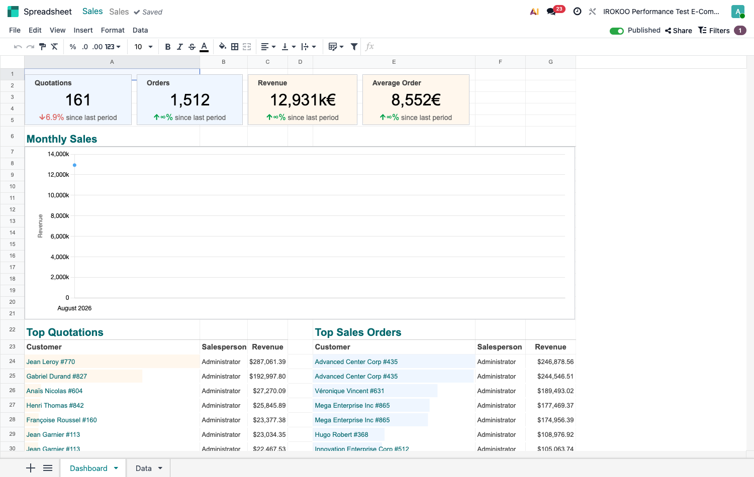
An integrated spreadsheet lets you rework Odoo data without exporting it: the values stay linked to the database and refresh.
Creating a spreadsheet from an analysis
- Build the analysis you want in pivot view.
- Use the insert-into-spreadsheet action.
- Choose the destination spreadsheet: a new one, or an existing one.
The inserted table keeps its link with the database: the amounts update when it is opened.
Working in the spreadsheet
- Calculation formulas and Odoo-specific functions, allowing values to be called directly from the database.
- Refreshable pivot tables.
- Charts, including hierarchical representations in concentric rings, useful for breaking a total down into nested subcategories.
- Conditional formatting, to colour cells automatically according to thresholds: margins below a floor, payment delays, budget variances.
- Global filters, applied to the whole spreadsheet.
Sharing
Spreadsheets can be shared with other users, commented on and embedded in dashboards.
Note
Connected spreadsheets belong to the Enterprise edition.
Astuce
Keep the spreadsheet for reprocessing: weightings, assumptions, presentation. For a question of fact, Odoo's pivot view answers faster and with no risk of a stale formula.
Exporting
- Open the list view and apply the filters you want.
- Select the records.
- Click Actions then Export.
- Choose the fields and the format.
- Save the export template for periodic analyses.
Connecting a business intelligence tool
An external business intelligence tool can connect directly to the database to build advanced analyses.
Point d'attention
This access is set up by the system administrator, with a dedicated read-only account. An external tool plugged into the production database with write rights, or with no load limiting, degrades performance for every user.
Alerts and periodic reports
Being alerted on a condition
An analysis answers a question that has been asked; it assumes someone thinks to ask it. An automation rule takes over whatever has to be watched continuously: it observes a data model and warns of its own accord as soon as a condition is met: internal notification, email, activity creation.
The situations that lend themselves to it: stock below the critical threshold, a high-stakes deal with no activity for a week, a customer approaching their credit limit, a quotation margin below a floor.
Creating a rule, its triggers and its actions are covered in chapitre 21, which also gives the module to install beforehand (see section 21.1.1).
Receiving a periodic report
Odoo can send, at regular intervals, a summary email covering a selection of indicators. The feature is provided by the KPI Digests module, which is almost always present already: accounting, inventory, CRM, sales, projects and automation rules all depend on it. Were it missing, it would be installed from Apps by removing the Apps filter, the module not being an application.
Once the module is in place:
- Open Settings › General Settings.
- In the Emails block, tick Digest Email.
- Choose the summary to send in the drop-down list that appears.
- Click Configure Digest Emails to open the summary and set its frequency, its indicators and its recipients.
Note
The same list is reached directly through Settings › Technical › Email › Digest Emails. The entry is reserved for settings administrators.
Point d'attention
Ticking the box does not subscribe existing users: the setting automatically adds new users as recipients. Accounts already created must be added by hand in the summary.
Filing documents automatically
The Documents application centralises the company's files and can sort incoming items: it assigns them a workspace and tags based on their content, then presents them for validation. It then feeds the other applications: a vendor bill dropped into the accounting space becomes an entry to check, a signed quotation goes back up onto the order.
Note
Documents belongs to the Enterprise edition and is a full application in its own right, with its own notions (workspaces, rights per space, tags, processing rules, validation flows) and some twenty integration modules with accounting, human resources, projects and electronic signature.
This guide, devoted to core features, does not go into that detail. Setting it up calls for dedicated support: do not hesitate to contact us (www.irokoo.fr, info\@irokoo.fr).
Good practice
Analyses that serve a purpose
- Make data entry reliable before building analyses: an elaborate report built on incomplete data gives false confidence.
- Use tags and categories consistently: they are the axes of every grouping.
- Limit a dashboard to what triggers a decision. Three indicators watched are worth more than fifteen consulted once.
- Always compare against a reference: previous period, target, budget. An isolated figure cannot be read.
- Drill down to the detail before concluding: double-clicking a value opens the records that make it up.